Product demos. Tech vs inspiration.
Heated debates invariably occur in all great client/agency relationships, and a recent project at Photokina forced some challenging conversations around product trials and how to best facilitate a hands-on approach that’s also meaningful.
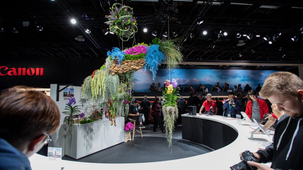
2LK has spent the last 10 months crafting a sensational 2600sqm brand experience at Photokina, the world’s leading consumer event for the photographic, imaging and video industries. Photography is a fiercely tribal market sector. Users tend to be aligned to a single brand, and typically invest long and hard in accumulating that brand’s kit. The prosumers that attend Photokina en masse are very knowledgeable. They have firm, preconceived opinions and a very specific agenda. They’re on a quest for niche technical detail and access to qualified professionals. A tough crowd to please.
So what did we learn, and how did a collaborative approach with our client yield great solutions? Here are my six tips towards better demo experiences:
1. Surprise and delight
A truly unexpected experience attracts attention, facilitates retention, and encourages return. There’s real value in providing distinctive ‘you had to be there’ moments. However, the surprise must also delight – there’s no point in shocking, scaring or confusing your audience. The delight might be a tiny obscure detail that’s been carefully considered, a unique personalised takeaway or a totally unexpected experience.
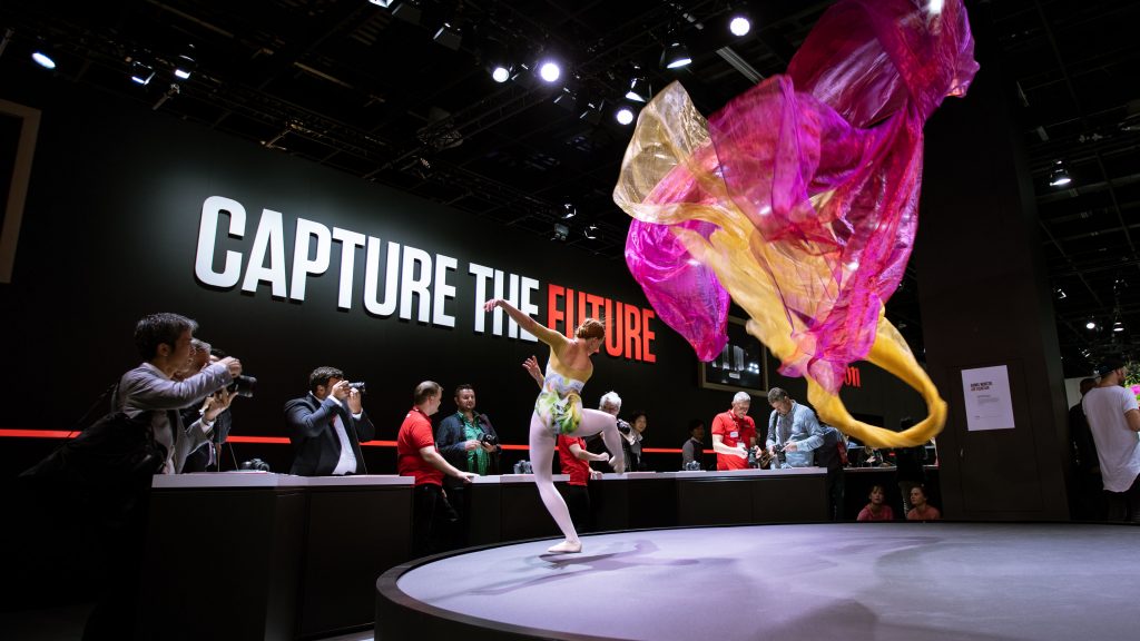
At Photokina, we installed ‘Air Fountain’ by Brooklyn-based artist Daniel Wurtzel. This incredibly emotive kinetic sculpture propelled silks into perpetual motion, alongside live dancers from the Birmingham Royal Ballet. Acting as a huge beacon, this centrepiece provided a dynamic and challenging shooting subject for visitors – a memorable and shareable hands-on camera experience.
2. Remove subjectivity
Product teams typically want detailed, lengthy, high-quality hands-on demo experiences that are rich in information and technically seamless, but marketing teams usually want a high volume of quick trials that have a simple takeaway and are rich with opportunities for social sharing. It’s a challenging quandary for experience designers.
Focus on results and common goals to help each party challenge the other without contention. Collectively agree clear, prioritised objectives. Then fiercely filter every design decision through these defined principles. Leave no room for personal opinions, individual preferences and emotional bias.
3. You’ll never know that much about rental cars
Bill Bernbach’s famous 1966 advertising contract with Avis stated, “DDB will never know as much about the rent-a-car business as Avis, and Avis will never know as much about advertising as DDB”. Agencies should listen to their clients, absorb their immense technical product knowledge, and learn from their past experiences. Then challenge each other. Hard. Translate knowledge into original, informed thinking that exploits opportunity and leverages creative expertise.
4. Humanise things
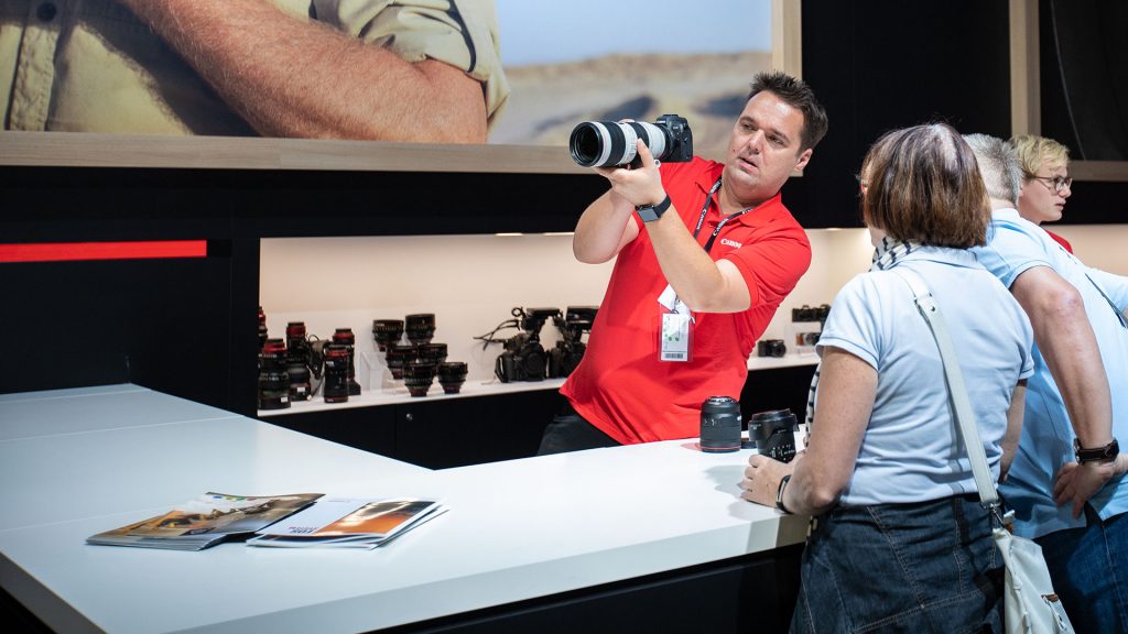
Knowing a product and knowing how to drive engagement are two very different things, so don’t rely on technical product teams to own the experience. However much cutting-edge technology you integrate into demos, be sure to serve it with a simple smile. Attendees are there for hands-on product experiences, but they’re also there to be with smart and well-informed specialists. Consult with staffing professionals, train the demo teams and humanise the experience in every possible way.
5. Format first
Tasty lighting details, considered material specifications, and a beautiful physical form do not alone make for a good demo experience. They certainly have a role, but start by thinking about the situation, the context of the trial, and the dynamics of staff versus audience. Focus on the conversation you’re trying to promote, then build the scene around that.
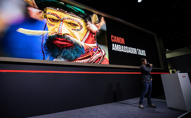
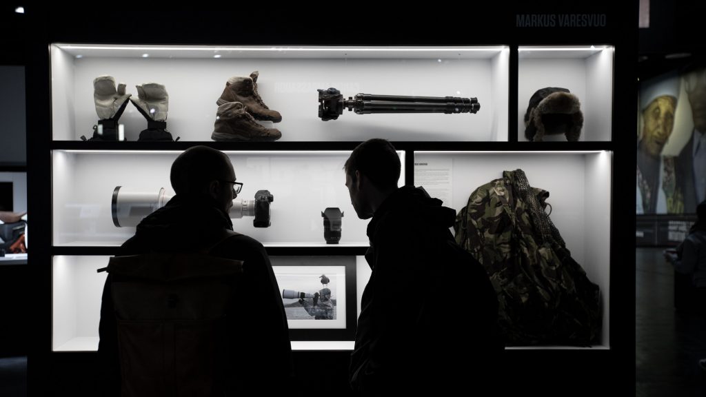
To reveal a deeper understanding of life behind the lens at Photokina, we curated the personal artefacts of ten brand ambassadors. Alongside this, large digital screens with dynamic content brought their imagery to life. This focus on personal ambition encouraged conversations around inspiration, a key pillar in the prosumer’s buying cycle.
6. (Re)script the narrative
One size does not fit all. However intuitive a demo experience might feel, take the time to script out different journeys that are specific to your users’ wants and needs. Getting the physical arrangement right and staffing it with well-trained teams is only half the battle. Be prepared to make real-time changes. You’ve already defined success, so make sure you’re measuring it – and that results are instantly accessible. If things aren’t working as expected, make immediate iterative changes, however disruptive this may feel.
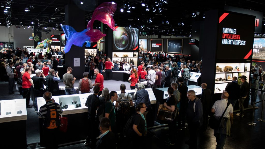
When we started working with our client, the pursuit of technical perfection seemed to be in conflict with the ambition to surprise, delight and inspire the audience at Photokina – and the quest for quality engagement contradicted target KPIs for a high quantity of hands-on trials. However, early results indicate that our approach has been a huge success.
Special thanks to Event Industry News for first publishing this article on 5 October 2018.
More reading: