Nobody is watching your corporate video.
Over the past 40 years, Sibos has grown from a banking operations seminar to the world’s premier financial services event – it’s all about making personal connections and that’s why exhibitors should beware of corporate videos.
I designed booths for our new client Royal Bank of Canada (RBC) as well as for existing clients HSBC and TD Bank at Sibos’ most recent annual conference, exhibition and networking event, which saw record-breaking visitor numbers in Toronto. ‘A coffee shop’ for the financial services sector, you won’t find an abundance of products or gadgets at this event. It’s all about first-class hospitality and comfortable environments for face-to-face meetings.
Go to an event in most sectors and you’ll see throngs of visitors checking out exhibitors’ cutting-edge technology and on-screen content, but at Sibos nearly all the booth guests and visitors on the peripherals barely even registered exhibitors’ on-screen content. That’s because it was all pretty much ‘same as’ boring corporate presentations. Little thought was given to what featured on these ‘billboards’. It just felt like a ticked box on someone’s list of what should feature on an exhibition stand.
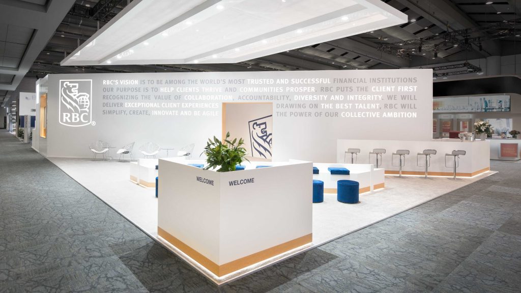
That’s why our work with RBC really stood out from the crowd. They wanted an impactful presence at Sibos to tell their story and vision. Given the needs of RBC and its visitors, it made perfect sense to explore options that weren’t heavily reliant on AV yet presented a progressive look and feel. Once released from the shackles of this modern day expectation, a far more creative design process emerged to showcase RBC’s vision.

When trying to convey a brand’s vision or story, what better way than to use those exact words? Simple illuminated typography on a large ‘canvas’ communicated RBC’s collective ambition. Stripped back minimalist styling focused all eyes on the animated copy. Distinctly different. Simplistically impactful. Far more engaging than a traditional corporate video could ever be. A form of AV was still required, but it wasn’t the main focus of the stand.
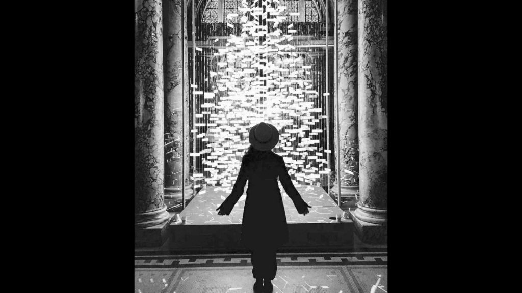
Upon my return from Sibos, I saw this same idea encapsulated in artist Es Devlin’s ‘The Singing Tree’ installation at the V&A – simple design and illuminated typography compelled you to read the messages.

[Image: https://esdevlin.com/work]
Should corporate videos be replaced with more thought-provoking stand architecture? Absolutely, if it’s right for the brand, the event and the visitor experience – but it does take both a brave client and a brave designer to resist the temptations of the latest shiny new tech in deference to a ‘simple is sometimes better’ mantra.
More reading: